« LinkedIn, Part Trois | Main | Repeat After Me: "The From Field is Forged" »
| Home | The Book | Training | Events | Tools | Stats |
August 20, 2010
Spampaign AnalysisThe activities of one particular spammer has caught my eye, and I've been monitoring the activity directed my way over the past few months. I don't know the identity of the spammer — the one responsible for putting the spam into inboxes — but all of the spamvertised domains are registered (privacy locked, of course) through Dynamic Dolphin, for many years one of Scott Richter's alleged homes.
What brought these messages to my attention is that the subject matter isn't the typical medz, knockoff goods, or other items pitched by the bulk of the world's spam. Look at these selected Subject/From combinations:
Residential House Painters Painting Become a CNA Certified Nursing Assistant Training Train to become a photographer Photography School No repair will go unfixed with a handyman Handyman Renovate your old bathroom Bathroom Remodeling Healthy careers inside Best Medical Billing Training Hire an expert to repair your roof today. Roof Repair Take a seat and sneak a peek at Private Jets. Private Jet Save on Contact Lenses and Supplies Contact Lenses Lasik Eye Surgery Lasik Government grant money is available Government Grants Record it all on a spy camera Security Cameras Discount air conditioners - energy efficient Air Conditioners Discount dog supplies online Dog Supplies Auto-Answering Service Answering Service Dont waste time cleaning. Hire a maid service. Housekeeping Service Easily save for retirement 401K Plans Find local personal injury lawyers. Personal Injury Lawyer
What struck me as being so odd is that many of these messages appeared to have a local appeal. I mean, a global spam campaign by a handyman service just doesn't seem right.
I'll come back to this in a minute, but first, more about the message content.
Over the past four months, the message body designs have changed. They started out with a simple format like this:
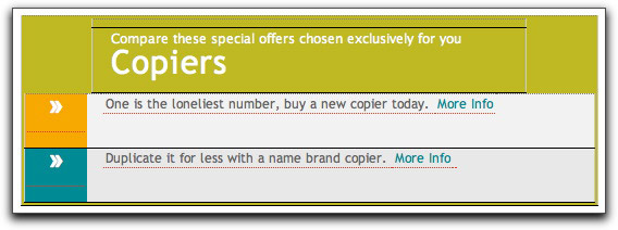
More recently they've been using a couple table-oriented layouts. One doesn't use images:
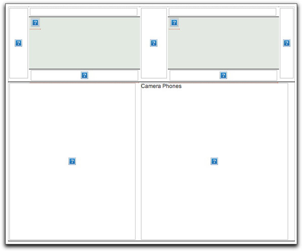
The other employs images in a variety of table cell proportions. Here's one (without downloading the images, as I'll explain in a moment):
The reason I don't show you all of the images is that each downloadable image URL (and link) is encoded with three identifying numbers. My assumption about these numbers is that they identify the actual advertiser account, campaign, and the recipient email address (the long number). I have my email client set to not download any remotely-accessed content without my approval, so this was one way to prevent my address from being confirmed to the spammer.
I did, however, find a workaround to conceal my address code, and here is an example of one of the image-based email bodies:
Notice that there is no identification of the entity offering the training being advertised. The same was true of the image-less ads. The From: email addresses were to the domains (gibberish) hosting the images and receiving the click-throughs.
What about CAN-SPAM, you ask? At the very bottom of every message is a link and purported mailing address to be removed from the mailing list. Here is what one of them looks like:
I say "one of them" because across the span of these mailings, I've seen several addresses in at least five states. One of them lists a company name, TLE Inc. Good luck with that. The "unsubscribe" links lead to an unsub.cgi program, and the URL is coded with the campaign and addressee ID numbers. I wouldn't click on one of those links with a ten-foot mouse.
Deeper inside the message is more stuff so typical of a spammer trying to beat the content filters by loading up the invisible body with tons of hash busting text. The general format of the hash-busting text is similar throughout all of the mailings, but their sending routines substitute words here and there to prevent being identified by the same strings.
All of the hash-busting text is embedded within a phony <style> tag (whose content doesn't render for the user to see). Here's a brief excerpt of stuff that's supposed to resemble style sheet specifications:
table .foulmouthed{ background:#D3E4E5;
border:1px solid gray;
border-collapse:collapse;
color:#fff;
font:normal 12px verdana, arial, helvetica, sans-serif;
}
caption .comfits{ border:1px solid #5C443A;
color:#5C443A;
font-weight:bold;
letter-spacing:20px;
padding:6px 4px 8px 0px;
text-align:center;
text-transform:uppercase;
}
howls td, bathrobe th { color:#363636;
padding:.4em;
}
argufy tr { border:1px dotted gray;
}
But then there are further blocks, sometimes of random dictionary words bashed together:
cacao/circulariserhydroxyproline/audit/crevice/bareknuckle/expressive/flutterboard/Decca/computerisation/flimsily/expurgator/apeldoorn/bondsman/concision/intraorganization-advocacy/idiotism-Crockford/clauses/bituminisingbummaree.carer/horizontalisationsacknowledgements/Koheleth/communalizes
plus many dozens of lines with single words between more dozens of blank lines between them. A typical message is formatted to contain over 3000 lines (mostly empty) with a character count approaching 20,000. The actual visible content portion is a tiny fraction of that.
By now, you must be wondering what's at the end of these links. By way of an email address identifier disguise, I found out for at least a couple (which I would wager is a sufficient sample size for this spammer).
I chose the police training and copier sites. The police training link navigated me beyond the domain in the emails to an online division of a small university in Ohio. Although I had never heard of the university, the .edu domain had been alive since 1994. The copier link delivered me to a company's web site that has (possibly) been around since 1997. But it's not that simple, it turns out.
Both sites lead the visitor through a multi-screen questionnaire that (in the sales biz terminology) qualifies the visitor for what kind of information they want to receive. In the case of the police training, the site actually advertises numerous curricula from which to choose. As you navigate through questionnaire screens, they want to know what your current education level is, your age, when you want to begin school, whether you're a U.S. citizen — all the kinds of things that an enrollment office for an online university would ask. The same was true for the copier site, which wants to know how many copiers you're looking for, whether you do mostly color, b&w, or both, your copier volume, how fast a copier you need, and so on.
Both sites have a quality feel to them. Although the designs are quite different, there is a similarity in how they report one's progress through the qualification stages (there is literally a progress bar). The copier site claims to have an A+ rating with the Better Business Bureau — an online claim that is worthless after having been so horribly abused by spammers over the years.
My takeaway from this lengthy series of campaigns is that an "email marketing" company (shudder) is either selling lead generation services to smaller organizations (including web site design), or it's gathering the leads on its own to rent out to other firms. In the process it is also gathering live email addresses through image retrievals and click-throughs (in fact, all clickable URLs have "clickthru" as part of the URLs).
Heaven knows what kind of B.S. these guys sell the people who buy their services. I'm sure it's full of stuff like "we email only to opt-in addresses" and the like — the same lies being peddled under the guise of email marketing for years and years. If they were so legitimate, they'd use one of the verified sender systems to guarantee delivery to those who want their messages and not load their messages with hash busters.
Although I'd like to know the identity of the sender, enough of my curiosity has been satisfied that I can now block these guys and never be bothered by them again.
Posted on August 20, 2010 at 11:31 AM


